Companies are increasingly recognizing the role diversity, equity, and inclusion (DEI) plays in creating a successful organization. Studies are finding that there is a strong connection between successful DEI efforts and company financial performance.
For instance, companies with the highest DEI scores on Glassdoor have an 80% higher ability to adapt than others. An organization’s improved ability to adapt – sometimes referred to as “change power” – led to 2x earnings before interest and taxes (EBIT) improvement, 2x in shareholder return, and 1.5-3x revenue growth, demonstrating a powerful intersection between successful DEI efforts and an organization’s financial performance. However, despite great progress in creating DEI programs, executives are struggling to measure and share the impact of diversity efforts. This has subsequent impacts on environmental, social, and governance (ESG) reporting, which will soon need to be addressed by public companies due to forthcoming regulatory changes.
To meet this reporting need, executives need a dashboard that provides comprehensive and current reporting of DEI data and key performance indicators (KPIs) in one place. Conventional human resources information systems (HRIS) software is capable of simple data visualizations, but the functionality of the reporting is often quite basic, lacking in customization or shareability internally and externally.
Now, companies are finding success quantifying DEI progress by building interactive dashboards in leading data analytics platforms, creating a new era of transformative insights for financial, operational, and executive teams.
What Is an Executive DEI Dashboard?
Executive DEI dashboards serve as a central hub for DEI data, consolidating information from various data sources into a user-friendly interface. These dashboards enable a holistic and interactive view of the organization’s diversity metrics, which allow executives and stakeholders to gain real-time insights and track progress against organizational goals.
Having such a comprehensive tool unlocks transparency within the company and fosters a culture of accountability. This ultimately encourages leaders to set and act upon measurable goals, track KPIs, and regularly evaluate DEI initiatives.
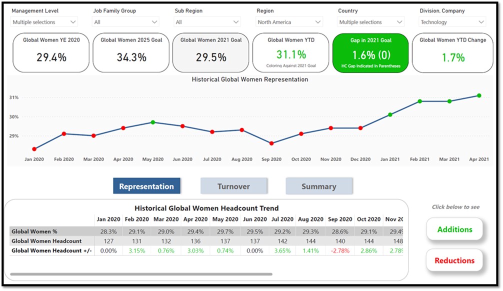
Below is an example of an executive DEI dashboard with various drillable views and insights:
How Does DEI Data Visualization Strengthen Decision-Making?
Accurate and up-to-date information is crucial for making informed decisions. Creating DEI reporting with modern data visualization tools, such as Power BI or Tableau, provides decision-makers with a wealth of information.
Leaders are able to identify patterns, trends, and disparities within the organization in custom views that are most effective for team goals. With such seamless and interactive access to HR data, leaders can develop data-driven strategies to pinpoint areas of concern and shortcomings, optimize resource allocation, and recognize effective practices. By leveraging data insights derived from the executive dashboard, organizations can align DEI efforts with broader business objectives and create a competitive advantage.
What Can Data Visualization Tools Do Better Than Conventional HRIS Solutions?
Executive DEI dashboards need to be adaptable, convenient, and comprehensive. While HRIS systems may have standard reporting functionalities to generate predefined reports and export data, data visualization tools are designed to present data in an interactive interface and can incorporate custom KPIs created by the organization.
Explore expert Data Transformation & Analytics solutions that solve real-world problems
Accelerate strategic adoption of data and analytics platforms within a scalable systems architecture for stronger performance reporting, cleaner insights, and greater change readiness.
Since these tools are built specifically for summarizing and presenting complex data sets to broad audiences, the collaboration features are also often much stronger than what can be found in a traditional HRIS solution.
Below are some key examples of where market-leading data visualization tools have an advantage:
- Enhanced visualization options: With a library of visualizations and custom visuals, data visualization tools enable the end user to present DEI data in engaging and impactful ways. Users can choose from a wide range of charts, infographics, and storytelling features to highlight key diversity insights.
- Trend analysis and forecasting: Superior trend analysis and forecasting features are incredibly useful in understanding the trajectory of DEI efforts. Users can analyze historical data and identify patterns to forecast future diversity performance.
- Data sourcing: These tools allow for integrating data from multiple sources as well, including popular HRIS systems like Workday. This means you can combine data from various systems, such as employee demographics in the HRIS and applicant tracking solutions, survey results from internal and third-party sources, and external benchmarks, to create a comprehensive collection of reports. By incorporating additional data, organizations can enrich their DEI analytics and gain a full understanding of diversity-related factors impacting their workforce.
- Sharing and accessibility: Robust collaboration features often facilitate teamwork and knowledge-sharing. Users can share the DEI dashboard with stakeholders across the organization, enabling them to interact with the data, ask questions, and explore insights. As an example, Power BI integrates seamlessly with Microsoft collaboration tools like Microsoft Teams.
- Security: Users can enable granular permissions and security settings, such as row-level security. Administrators can control access to sensitive personally identifiable information (PII) data as is common with HR datasets and restrict editing rights based on user roles and responsibilities. This ensures that only authorized individuals can view, modify, or share specific content. For example, executives may choose to restrict access to DEI data at a location, department, or business unit level.
How Do Dashboards Improve DEI Results?
The level of accessibility gained through an executive DEI dashboard empowers organizations to identify specific areas that require attention, then tailor interventions accordingly. For instance, if the data reveals disparities in promotion rates among certain demographics, companies can implement targeted mentoring programs or training initiatives to address these gaps.
The ability to pinpoint challenges and develop focused HR strategies to combat those challenges enhances the effectiveness of DEI initiatives. Over time, these data-driven decisions can drive greater workplace inclusivity while also strengthening the organization’s ability to adapt.
The newfound transparency, actionable insights, and stakeholder engagement in executive DEI dashboards directly contribute to measurable, meaningful DEI outcomes. With the right information available, leaders can take decisive steps toward implementing tailored DEI action plans and more efficiently report metrics to employees, boards, investors, customers, partners, and more.
For expert support developing practical, impactful reporting tools, contact CrossCountry Consulting.